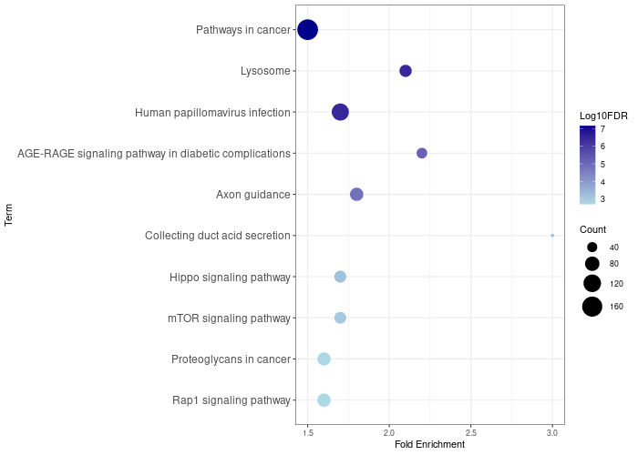
Creating a Bubble Plot with ggplot2 and readxl in R
gene_x 0 like s 919 view s
Tags: plot, R
The input file can be downloaded here!
The code for creating the bubble plot above is written in R and utilizes the ggplot2 and readxl packages. It has the following steps:
-
Load required libraries: The ggplot2 library is used for data visualization, and the readxl library is used to read data from Excel files.
library(ggplot2) library(readxl) -
Read the data: The read_excel() function reads the data from the "WT.xlsx" file and stores it in the WT dataframe.
WT <- read_excel("WT.xlsx") -
Create the plot: The ggplot() function initializes the plot with the dataset (WT) and the aesthetics (Fold_Enrichment on the x-axis, reordered Term on the y-axis based on Log10FDR values).
p = ggplot(WT, aes(Fold_Enrichment, reorder(Term, Log10FDR, order = TRUE))) -
Add color and size to points: This step adds color to the points based on the "Log10FDR" variable and sets the size according to the "Count" variable.
pbubble = p + geom_point(aes(size=Count, color=Log10FDR)) -
Customize the plot: This step sets the color gradient for points, labels the x-axis, and adjusts the size of the points.
pr = pbubble + scale_color_gradient(low = "lightblue", high = "darkblue") + labs(x="Fold Enrichment", y="Term") + scale_size_continuous(range = c(1,10)) -
Increase font size of y-axis labels: The theme() function is used to increase the font size of y-axis labels (terms) to 12.
pr = pr + theme_bw() + theme(axis.text.y = element_text(size = 12)) -
Save the plot: The png() function saves the plot as a PNG file with the specified dimensions, and the print() function prints the plot to the output file. The dev.off() function closes the graphics device, finalizing the output file.
png("TFEB-wt24.png", width=700, height=500)
print(pr)
dev.off()
This code will generate a scatter plot with points colored and sized based on the "Log10FDR" and "Count" variables, respectively. The y-axis labels (terms) will be ordered according to the "Log10FDR" values and have an increased font size.
点赞本文的读者
还没有人对此文章表态
本文有评论
没有评论
看文章,发评论,不要沉默
最受欢迎文章
- Motif Discovery in Biological Sequences: A Comparison of MEME and HOMER
- Calling peaks using findPeaks of HOMER
- Kraken2 Installation and Usage Guide
- Why Do Significant Gene Lists Change After Adding Additional Conditions in Differential Gene Expression Analysis?
- Should the inputs for GSVA be normalized or raw?
- PiCRUST2 Pipeline for Functional Prediction and Pathway Analysis in Metagenomics
- Updating Human Gene Identifiers using Ensembl BioMart: A Step-by-Step Guide
- pheatmap vs heatmap.2
- Setup conda environments
- Guide to Submitting Data to GEO (Gene Expression Omnibus)
最新文章
- Risks of Rebooting into Rescue Mode
- 足突(Podosome)、胞外囊泡(Extracellular Vesicle)与基质金属蛋白酶(MMPs)综合解析
- NCBI BioSample Submission Strategy for PJI and Nasal Microbiota Study
- Human RNA-seq processing for Data_Ben_RNAseq_2025
最多评论文章
- Updating Human Gene Identifiers using Ensembl BioMart: A Step-by-Step Guide
- The top 10 genes
- Retrieving KEGG Genes Using Bioservices in Python
推荐相似文章
MicrobiotaProcess Group2 vs Group6 (v1)
Bubble plot for 1457∆atlE vs 1457-M10 vs 1457 vs mock
