How to use MicrobiotaProcess?
gene_x 0 like s 1888 view s
Tags: plot, packages, R, 16S
MicrobiotaProcess is an R package designed for the analysis and visualization of microbiome data. It provides a variety of tools for researchers to explore and interpret their microbiome data, enabling streamlined processing and insightful data analysis. The package is part of the Bioconductor project and can be found at: https://www.bioconductor.org/packages/release/bioc/html/MicrobiotaProcess.html
-
bridges other tools: MicrobiotaProcess provides several functions to parsing the output of upstream analysis tools of microbiome, such as qiime2(Bolyen et al. 2019), dada2(Callahan et al. 2016) and MetaPhlAn(Beghini et al. 2021), and return MPSE object. Some bioconductor class, such as phyloseq(McMurdie and Holmes 2013), TreeSummarizedExperiment(Huang et al. 2021) and SummarizedExperiment(Morgan et al. 2021) can also be converted to MPSE via as.MPSE().
##https://github.com/YuLab-SMU/MicrobiotaProcess ##https://www.bioconductor.org/packages/release/bioc/vignettes/MicrobiotaProcess/inst/doc/MicrobiotaProcess.html ##https://chiliubio.github.io/microeco_tutorial/intro.html#framework ##https://yiluheihei.github.io/microbiomeMarker/reference/plot_cladogram.html #BiocManager::install("MicrobiotaProcess") #install.packages("microeco") #install.packages("ggalluvial") #install.packages("ggh4x") library(MicrobiotaProcess) library(microeco) library(ggalluvial) library(ggh4x) library(gghalves) ## Convert the phyloseq object to a MicrobiotaProcess object #mp <- as.MicrobiotaProcess(ps.ng.tax) #mt <- phyloseq2microeco(ps.ng.tax) #--> ERROR #abundance_table <- mt$abun_table #taxonomy_table <- mt$tax_table #ps.ng.tax_abund <- phyloseq::filter_taxa(ps.ng.tax, function(x) sum(x > total * 0.01) > 0, TRUE) #ps.ng.tax_most = phyloseq::filter_taxa(ps.ng.tax_rel, function(x) mean(x) > 0.001, TRUE) #mpse <- ps.ng.tax %>% as.MPSE() mpse_abund <- ps.ng.tax_abund %>% as.MPSE() #ps.ng.tax_sel <- ps.ng.tax ##otu_table(ps.ng.tax_sel) <- otu_table(ps.ng.tax)[,c("1","2","5","6","7", "15","16","17","18","19","20", "29","30","31","32", "40","41","42","43","44","46")] #otu_table(ps.ng.tax_sel) <- otu_table(ps.ng.tax)[,c("8","9","10","12","13","14", "21","22","23","24","25","26","27","28", "33","34","35","36","37","38","39","51", "47","48","49","50","52","53","55")] #mpse_abund <- ps.ng.tax_sel %>% as.MPSE() -
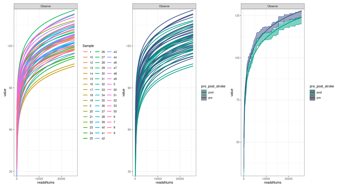
alpha diversity analysis: Rarefaction, based on sampling technique, was used to compensate for the effect of sample size on the number of units observed in a sample(Siegel 2004). MicrobiotaProcess provided mp_cal_rarecurve and mp_plot_rarecurve to calculate and plot the curves based on rrarefy of vegan(Oksanen et al. 2019).
# Rarefied species richness + RareAbundance mpse_abund %<>% mp_rrarefy() # 'chunks' represent the split number of each sample to calculate alpha # diversity, default is 400. e.g. If a sample has total 40000 # reads, if chunks is 400, it will be split to 100 sub-samples # (100, 200, 300,..., 40000), then alpha diversity index was # calculated based on the sub-samples. # '.abundance' the column name of abundance, if the '.abundance' is not be # rarefied calculate rarecurve, user can specific 'force=TRUE'. # + RareAbundance mpse_abund %<>% mp_cal_rarecurve( .abundance = RareAbundance, chunks = 400 ) # The RareAbundanceRarecurve column will be added the colData slot # automatically (default action="add") mpse_abund %>% print(width=180, n=100) # default will display the confidence interval around smooth. # se=TRUE p1 <- mpse_abund %>% mp_plot_rarecurve( .rare = RareAbundanceRarecurve, .alpha = Observe, ) p2 <- mpse_abund %>% mp_plot_rarecurve( .rare = RareAbundanceRarecurve, .alpha = Observe, .group = pre_post_stroke ) + scale_color_manual(values=c("#00A087FF", "#3C5488FF")) + scale_fill_manual(values=c("#00A087FF", "#3C5488FF"), guide="none") # combine the samples belong to the same groups if plot.group=TRUE p3 <- mpse_abund %>% mp_plot_rarecurve( .rare = RareAbundanceRarecurve, .alpha = "Observe", .group = pre_post_stroke, plot.group = TRUE ) + scale_color_manual(values=c("#00A087FF", "#3C5488FF")) + scale_fill_manual(values=c("#00A087FF", "#3C5488FF"),guide="none") png("rarefaction_of_samples_or_groups.png", width=1080, height=600) p1 + p2 + p3 dev.off() -
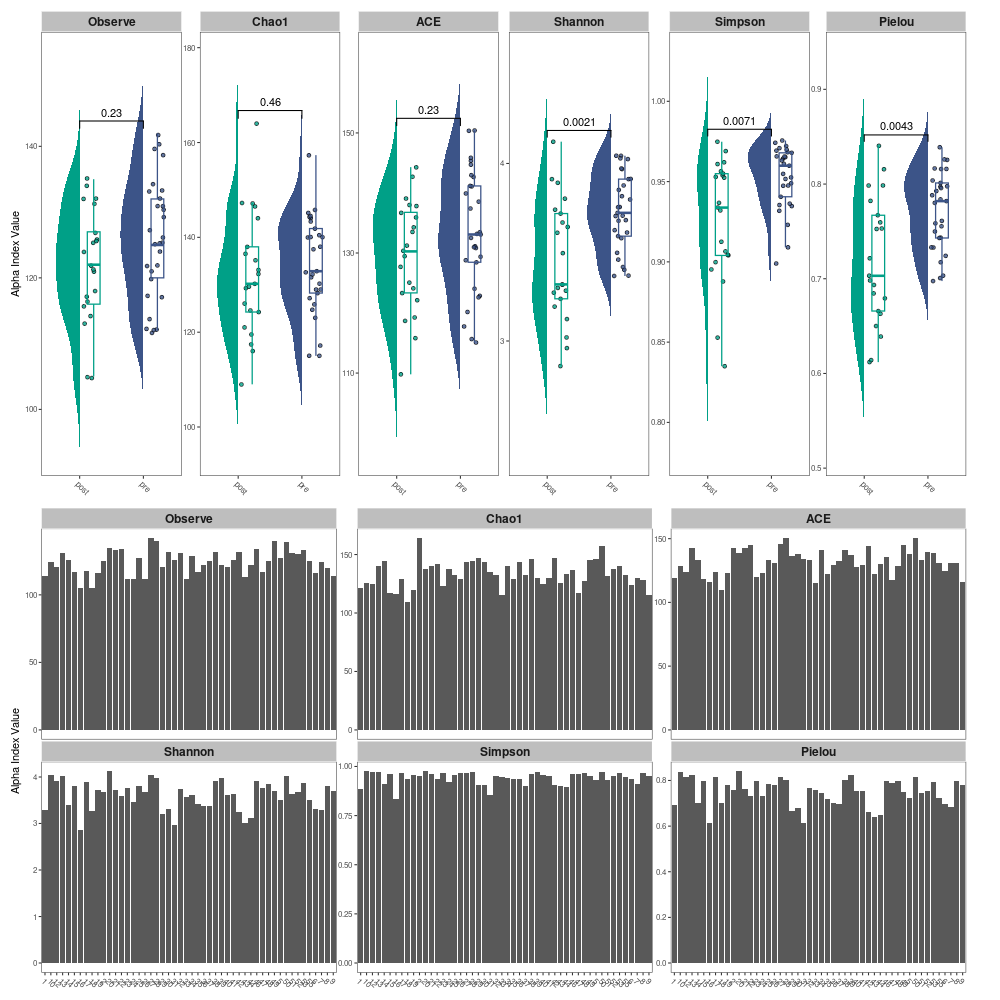
calculate alpha index and visualization: Alpha diversity can be estimated the species richness and evenness of some species communities. MicrobiotaProcess provides mp_cal_alpha to calculate alpha index (Observe, Chao1, ACE, Shannon, Simpson and J (Pielou’s evenness)) and the mp_plot_alpha to visualize the result. library(ggplot2) library(MicrobiotaProcess) mpse_abund %<>% mp_cal_alpha(.abundance=RareAbundance) mpse_abund
f1 <- mpse_abund %>% mp_plot_alpha( .group=pre_post_stroke, .alpha=c(Observe, Chao1, ACE, Shannon, Simpson, Pielou) ) + scale_fill_manual(values=c("#00A087FF", "#3C5488FF"), guide="none") + scale_color_manual(values=c("#00A087FF", "#3C5488FF"), guide="none") f2 <- mpse_abund %>% mp_plot_alpha( .alpha=c(Observe, Chao1, ACE, Shannon, Simpson, Pielou) ) png("alpha_diversity_comparison.png", width=1000, height=1000) f1 / f2 dev.off() -
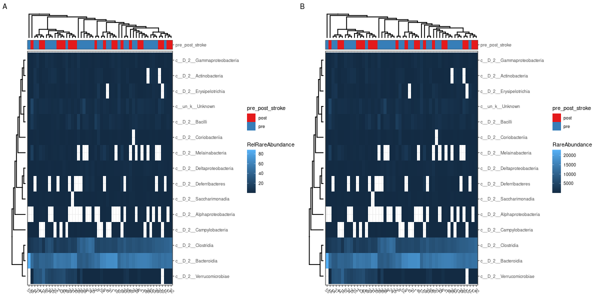
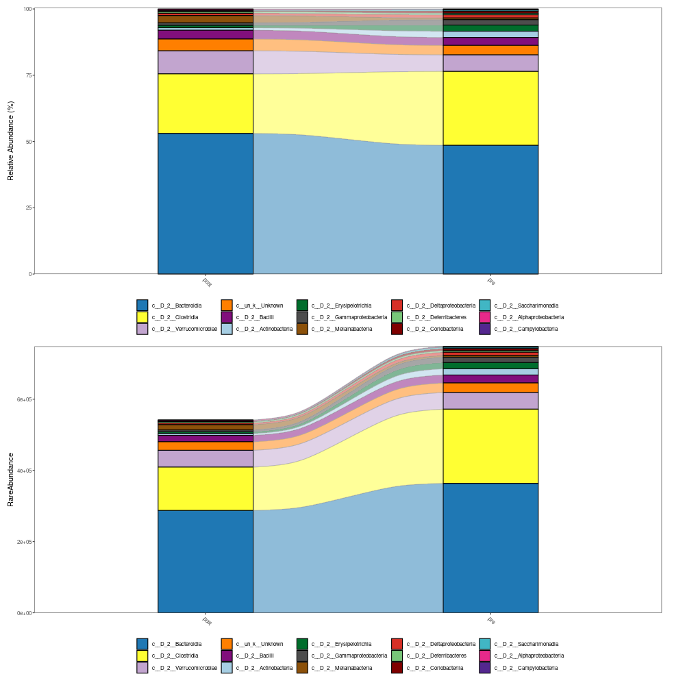
The visualization of taxonomy abundance: MicrobiotaProcess provides the mp_cal_abundance, mp_plot_abundance to calculate and plot the composition of species communities. And the mp_extract_abundance can extract the abundance of specific taxonomy level. User can also extract the abundance table to perform external analysis such as visualize manually (see the example of mp_cal_abundance).
mpse_abund %<>% mp_cal_abundance( # for each samples .abundance = RareAbundance ) %>% mp_cal_abundance( # for each groups .abundance=RareAbundance, .group=pre_post_stroke ) mpse_abund # visualize the relative abundance of top 20 phyla for each sample. p1 <- mpse_abund %>% mp_plot_abundance( .abundance=RareAbundance, .group=time, taxa.class = Class, topn = 20, relative = TRUE ) # visualize the abundance (rarefied) of top 20 phyla for each sample. p2 <- mpse_abund %>% mp_plot_abundance( .abundance=RareAbundance, .group=time, taxa.class = Class, topn = 20, relative = FALSE ) png("relative_abundance_and_abundance.png", width= 1200, height=600) #NOT PRODUCED! p1 / p2 dev.off() h1 <- mpse_abund %>% mp_plot_abundance( .abundance = RareAbundance, .group = pre_post_stroke, taxa.class = Class, relative = TRUE, topn = 20, geom = 'heatmap', features.dist = 'euclidean', features.hclust = 'average', sample.dist = 'bray', sample.hclust = 'average' ) h2 <- mpse_abund %>% mp_plot_abundance( .abundance = RareAbundance, .group = pre_post_stroke, taxa.class = Class, relative = FALSE, topn = 20, geom = 'heatmap', features.dist = 'euclidean', features.hclust = 'average', sample.dist = 'bray', sample.hclust = 'average' ) # the character (scale or theme) of figure can be adjusted by set_scale_theme # refer to the mp_plot_dist png("relative_abundance_and_abundance_heatmap.png", width= 1200, height=600) aplot::plot_list(gglist=list(h1, h2), tag_levels="A") dev.off() # visualize the relative abundance of top 20 class for each .group (pre_post_stroke) p3 <- mpse_abund %>% mp_plot_abundance( .abundance=RareAbundance, .group=pre_post_stroke, taxa.class = Class, topn = 20, plot.group = TRUE ) # visualize the abundance of top 20 phyla for each .group (time) p4 <- mpse_abund %>% mp_plot_abundance( .abundance=RareAbundance, .group= pre_post_stroke, taxa.class = Class, topn = 20, relative = FALSE, plot.group = TRUE ) png("relative_abundance_and_abundance_groups.png", width= 1000, height=1000) p3 / p4 dev.off() -
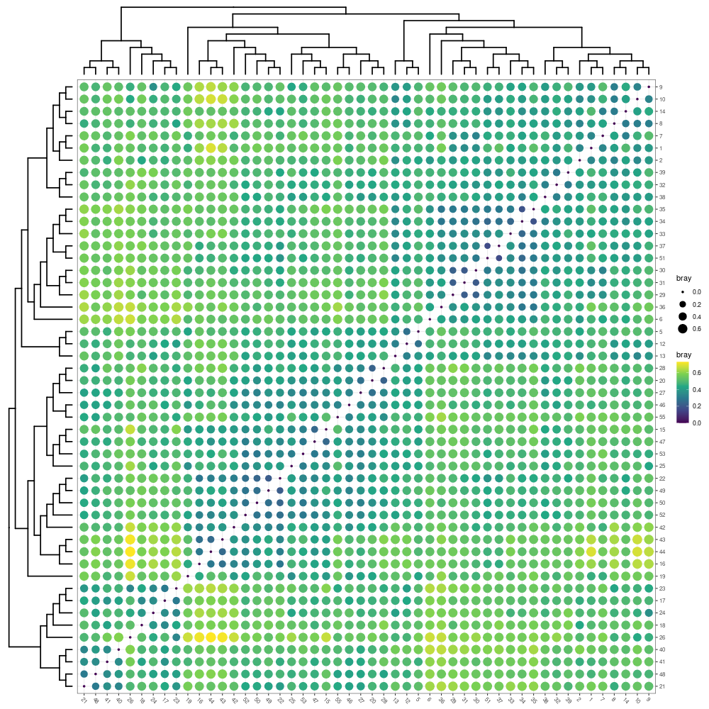
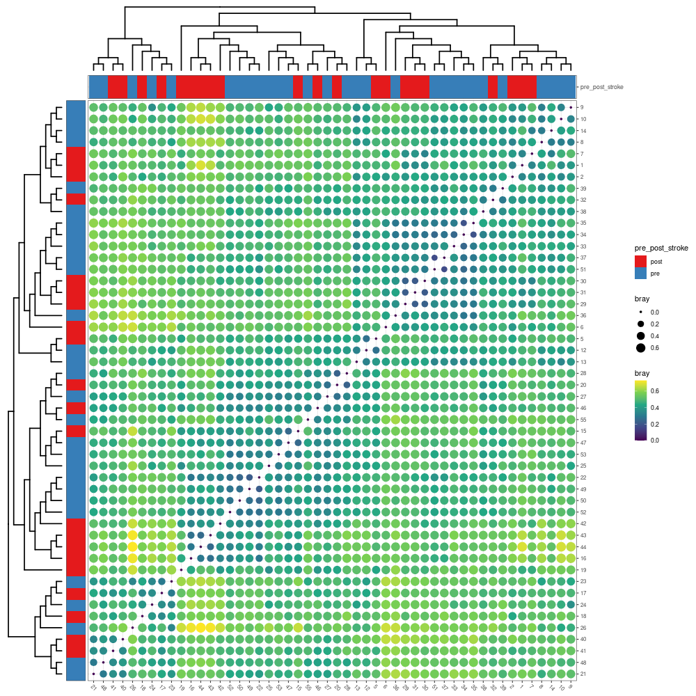
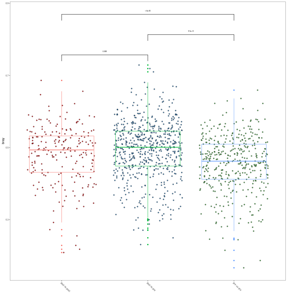
Beta diversity analysis: Beta diversity is used to quantify the dissimilarities between the communities (samples). Some distance indexes, such as Bray-Curtis index, Jaccard index, UniFrac (weighted or unweighted) index, are useful for or popular with the community ecologists. Many ordination methods are used to estimated the dissimilarities in community ecology. MicrobiotaProcess implements mp_cal_dist to calculate the common distance, and provided mp_plot_dist to visualize the result. It also provides several commonly-used ordination methods, such as PCA (mp_cal_pca), PCoA (mp_cal_pcoa), NMDS (mp_cal_nmds), DCA (mp_cal_dca), RDA (mp_cal_rda), CCA (mp_cal_cca), and a function (mp_envfit) fits environmental vectors or factors onto an ordination. Moreover, it also wraps several statistical analysis for the distance matrices, such as adonis (mp_adonis), anosim (mp_anosim), mrpp (mp_mrpp) and mantel (mp_mantel). All these functions are developed based on tidy-like framework, and provided unified grammar, we believe these functions will help users to do the ordination analysis more conveniently.
5.1. The distance between samples or groups: # standardization # mp_decostand wraps the decostand of vegan, which provides # many standardization methods for community ecology. # default is hellinger, then the abundance processed will # be stored to the assays slot. mpse_abund %<>% mp_decostand(.abundance=Abundance) mpse_abund
# calculate the distance between the samples.
# the distance will be generated a nested tibble and added to the
# colData slot.
mpse_abund %<>% mp_cal_dist(.abundance=hellinger, distmethod="bray")
mpse_abund

# mp_plot_dist provides there methods to visualize the distance between the samples or groups
# when .group is not provided, the dot heatmap plot will be return
p1 <- mpse_abund %>% mp_plot_dist(.distmethod = bray)
png("distance_between_samples.png", width= 1000, height=1000)
p1
dev.off()

# when .group is provided, the dot heatmap plot with group information will be return.
p2 <- mpse_abund %>% mp_plot_dist(.distmethod = bray, .group = pre_post_stroke)
# The scale or theme of dot heatmap plot can be adjusted using set_scale_theme function.
p2 %>% set_scale_theme(
          x = scale_fill_manual(
                  values=c("orange", "deepskyblue"),
                  guide = guide_legend(
                              keywidth = 1,
                              keyheight = 0.5,
                              title.theme = element_text(size=8),
                              label.theme = element_text(size=6)
                  )
              ),
          aes_var = pre_post_stroke # specific the name of variable
        ) %>%
        set_scale_theme(
          x = scale_color_gradient(
                  guide = guide_legend(keywidth = 0.5, keyheight = 0.5)
              ),
          aes_var = bray
        ) %>%
        set_scale_theme(
          x = scale_size_continuous(
                  range = c(0.1, 3),
                  guide = guide_legend(keywidth = 0.5, keyheight = 0.5)
              ),
          aes_var = bray
        )
png("distance_between_samples_with_group_info.png", width= 1000, height=1000)
p2
dev.off()

# when .group is provided and group.test is TRUE, the comparison of different groups will be returned
p3 <- mpse_abund %>% mp_plot_dist(.distmethod = bray, .group = pre_post_stroke, group.test=TRUE, textsize=2)
png("comparison_of_distance.png", width= 1000, height=1000)
p3
dev.off()
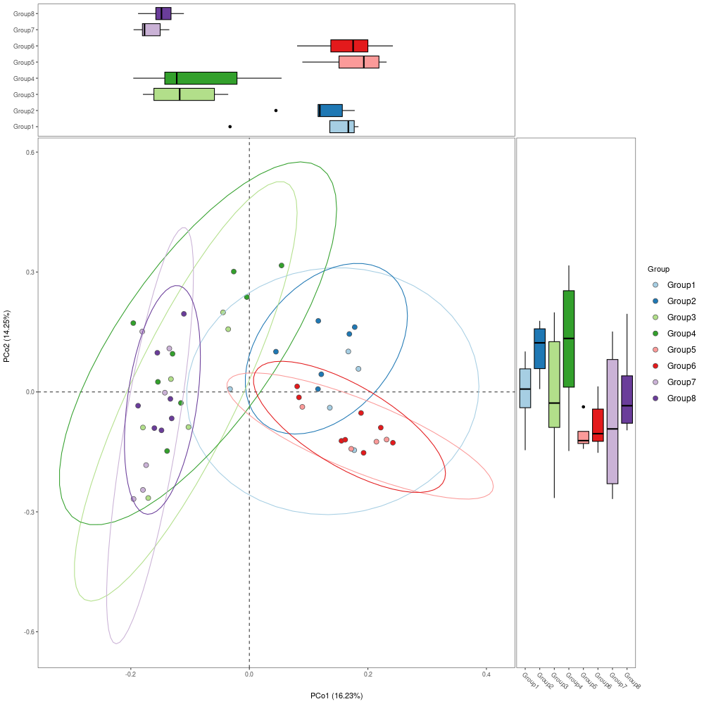
5.2. The PCoA analysis: The distance can be used to do the ordination analysis, such as PCoA, NMDS, etc. Here, we only show the example of PCoA analysis, other ordinations can refer to the examples and the usages of the corresponding functions. #install.packages("corrr") library(corrr) #install.packages("ggside") library(ggside) mpse_abund %<>% mp_cal_pcoa(.abundance=hellinger, distmethod="bray") # The dimensions of ordination analysis will be added the colData slot (default). mpse_abund
# We also can perform adonis or anosim to check whether it is significant to the dissimilarities of groups.
mpse_abund %<>%
      mp_adonis(.abundance=hellinger, .formula=~Group, distmethod="bray", permutations=9999, action="add")
mpse_abund %>% mp_extract_internal_attr(name=adonis)

# ("1","2","5","6","7",  "15","16","17","18","19","20",  "29","30","31","32",  "40","41","42","43","44","46")
#div.df2[div.df2 == "Group1"] <- "aged.post"
#div.df2[div.df2 == "Group3"] <- "young.post"
#div.df2[div.df2 == "Group5"] <- "aged.post"
#div.df2[div.df2 == "Group7"] <- "young.post"

# ("8","9","10","12","13","14",  "21","22","23","24","25","26","27","28",  "33","34","35","36","37","38","39","51",  "47","48","49","50","52","53","55")
#div.df2[div.df2 == "Group2"] <- "aged.pre"
#div.df2[div.df2 == "Group4"] <- "young.pre"
#div.df2[div.df2 == "Group6"] <- "aged.pre"
#div.df2[div.df2 == "Group8"] <- "young.pre"

#Group1: f.aged and post
#Group2: f.aged and pre
#Group3: f.young and post
#Group4: f.young and pre
#Group5: m.aged and post
#Group6: m.aged and pre
#Group7: m.young and post
#Group8: m.young and pre

#[,c("1","2","5","6","7",                "8","9","10","12","13","14")]
#[,c("15","16","17","18","19","20",      "21","22","23","24","25","26","27","28")]
#[,c("29","30","31","32",                "33","34","35","36","37","38","39","51")]
#[,c("40","41","42","43","44","46",      "47","48","49","50","52","53","55")]

p1 <- mpse_abund %>%
        mp_plot_ord(
          .ord = pcoa,
          .group = Group,
          .color = Group,
          .size = 2.4,
          .alpha = 1,
          ellipse = TRUE,
          show.legend = FALSE # don't display the legend of stat_ellipse
        ) +
        scale_fill_manual(
          #values = c("#a6cee3", "#1f78b4", "#b2df8a", "#33a02c", "#fb9a99", "#e31a1c", "#cab2d6", "#6a3d9a"),
          #values = c("#a6cee3", "#b2df8a", "#fb9a99", "#cab2d6"),
          values = c("#1f78b4", "#33a02c", "#e31a1c", "#6a3d9a"),
          guide = guide_legend(keywidth=1.6, keyheight=1.6, label.theme=element_text(size=12))
        ) +
        scale_color_manual(
          #values=c("#a6cee3", "#1f78b4", "#b2df8a", "#33a02c", "#fb9a99", "#e31a1c", "#cab2d6", "#6a3d9a"),
          #values = c("#a6cee3", "#b2df8a", "#fb9a99", "#cab2d6"),
          values = c("#1f78b4", "#33a02c", "#e31a1c", "#6a3d9a"),
          guide = guide_legend(keywidth=1.6, keyheight=1.6, label.theme=element_text(size=12))
        )
        #scale_fill_manual(values=c("#FF0000", "#000000", "#0000FF", "#C0C0C0", "#00FF00", "#FFFF00", "#00FFFF", "#FFA500")) +
        #scale_color_manual(values=c("#FF0000", "#000000", "#0000FF", "#C0C0C0", "#00FF00", "#FFFF00", "#00FFFF", "#FFA500"))
        #scale_fill_manual(values=c("#00A087FF", "#3C5488FF")) +
        #scale_color_manual(values=c("#00A087FF", "#3C5488FF"))

# The size of point also can be mapped to other variables such as Observe, or Shannon
# Then the alpha diversity and beta diversity will be displayed simultaneously.
p2 <- mpse_abund %>%
        mp_plot_ord(
          .ord = pcoa,
          .group = Group,
          .color = Group,
          .size = Shannon,
          .alpha = Observe,
          ellipse = TRUE,
          show.legend = FALSE # don't display the legend of stat_ellipse
        ) +
        scale_fill_manual(
          values = c("#FF0000", "#000000", "#0000FF", "#C0C0C0", "#00FF00", "#FFFF00", "#00FFFF", "#FFA500"),
          guide = guide_legend(keywidth=0.6, keyheight=0.6, label.theme=element_text(size=8))
        ) +
        scale_color_manual(
          values=c("#FF0000", "#000000", "#0000FF", "#C0C0C0", "#00FF00", "#FFFF00", "#00FFFF", "#FFA500"),
          guide = guide_legend(keywidth=0.6, keyheight=0.6, label.theme=element_text(size=8))
        ) +
        scale_size_continuous(
          range=c(0.5, 3),
          guide = guide_legend(keywidth=0.6, keyheight=0.6, label.theme=element_text(size=8))
        )
png("PCoA.png", width= 1000, height=1000)
p1
dev.off()
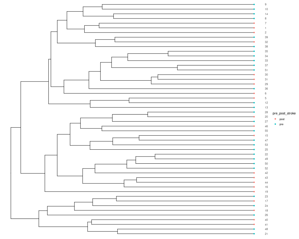
5.3. Hierarchical cluster analysis: The distance of samples can also be used to perform the hierarchical cluster analysis to estimated the dissimilarities of samples. MicrobiotaProcess presents mp_cal_clust to perform this analysis. It also is implemented with the tidy-like framework. #input should contain hellinger! mpse_abund %<>% mp_cal_clust( .abundance = hellinger, distmethod = "bray", hclustmethod = "average", # (UPGAE) action = "add" # action is used to control which result will be returned ) mpse_abund
# if action = 'add', the result of hierarchical cluster will be added to the MPSE object
# mp_extract_internal_attr can extract it. It is a treedata object, so it can be visualized
# by ggtree.
sample.clust <- mpse_abund %>% mp_extract_internal_attr(name='SampleClust')
sample.clust

library(ggtree)
p_cluster <- ggtree(sample.clust) +
        geom_tippoint(aes(color=pre_post_stroke)) +
        geom_tiplab(as_ylab = TRUE) +
        ggplot2::scale_x_continuous(expand=c(0, 0.01))
png("hierarchical_cluster1.png", width= 1000, height=800)
p_cluster
dev.off()

library(ggtreeExtra)
library(ggplot2)
# # Extract relative abundance of phyla
# phyla.tb <- mouse.time.mpse %>%
#             mp_extract_abundance(taxa.class=Phylum, topn=30)
# # The abundance of each samples is nested, it can be flatted using the unnest of tidyr.
# phyla.tb %<>% tidyr::unnest(cols=RareAbundanceBySample) %>% dplyr::rename(Phyla="label")
# phyla.tb
#
# p1 <- p +
#       geom_fruit(
#          data=phyla.tb,
#          geom=geom_col,
#          mapping = aes(x = RelRareAbundanceBySample,
#                        y = Sample,
#                        fill = Phyla
#                  ),
#          orientation = "y",
#          #offset = 0.4,
#          pwidth = 3,
#          axis.params = list(axis = "x",
#                             title = "The relative abundance of phyla (%)",
#                             title.size = 4,
#                             text.size = 2,
#                             vjust = 1),
#          grid.params = list()
#       )
# png("hierarchical_cluster2.png", width = 1000, height = 800)
# p1
# dev.off()

# Extract relative abundance of classes
mpse_abund %>% print(width=150)
class.tb <- mpse_abund %>%
            mp_extract_abundance(taxa.class = Class, topn = 30)
# Flatten and rename the columns
class.tb %<>% tidyr::unnest(cols = RareAbundanceBySample) %>% dplyr::rename(Class = "label")
# View the data frame
class.tb
# Create the plot
p1 <- p +
      geom_fruit(
          data = class.tb,
          geom = geom_col,
          mapping = aes(x = RelRareAbundanceBySample,
                        y = Sample,
                        fill = Class
                  ),
          orientation = "y",
          pwidth = 3,
          axis.params = list(axis = "x",
                            title = "The relative abundance of classes (%)",
                            title.size = 4,
                            text.size = 2,
                            vjust = 1),
          grid.params = list()
      )

# Save the plot to a file
png("hierarchical_cluster2.png", width = 1000, height = 800)
print(p1)
dev.off()
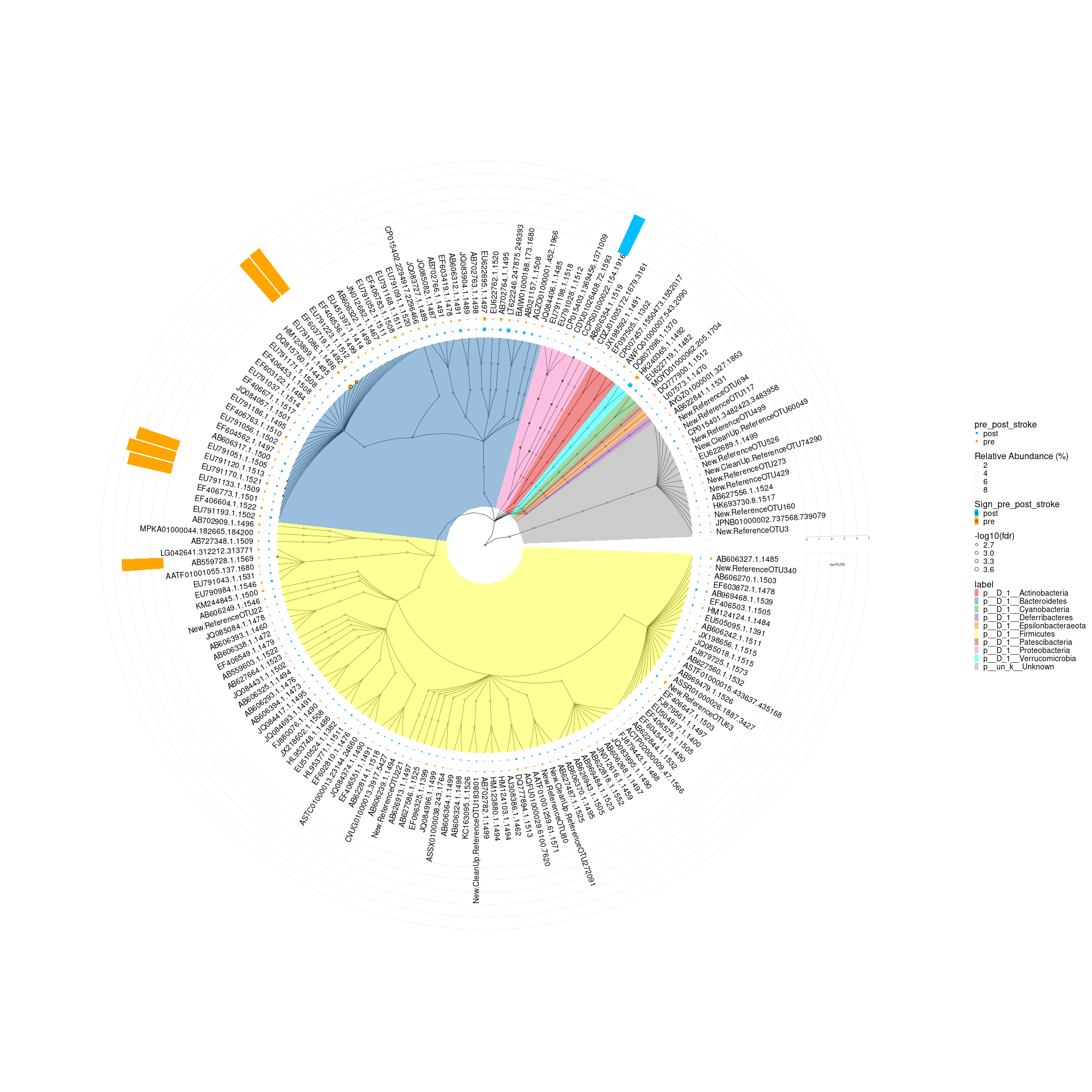
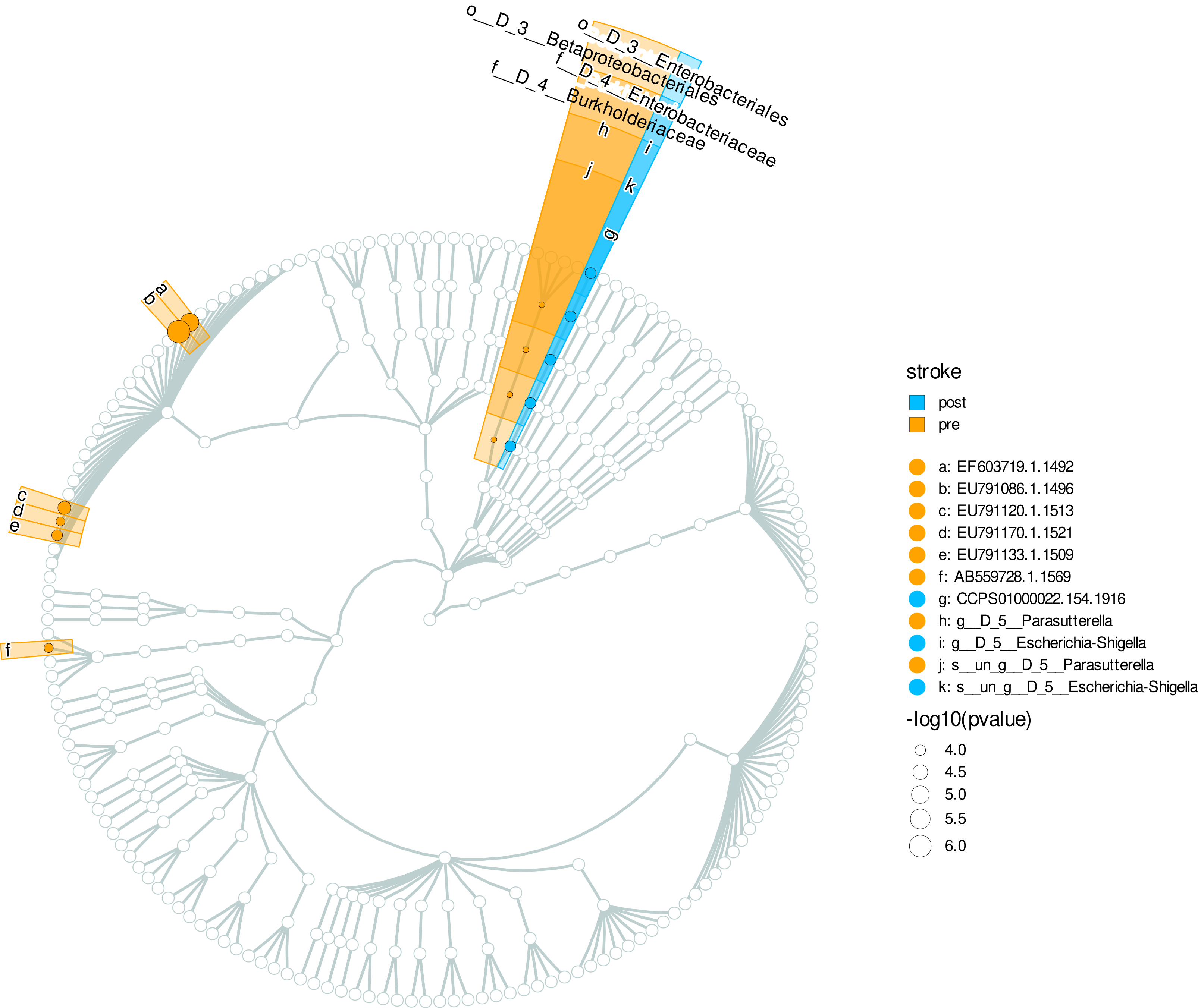
5.4. Biomarker discovery: The MicrobiotaProcess presents mp_diff_analysis for the biomarker discovery based on tidy-like framework. The rule of mp_diff_analysis is similar with the LEfSe(Nicola Segata and Huttenhower 2011). First, all features are tested whether values in different classes are differentially distributed. Second, the significantly different features are tested whether all pairwise comparisons between subclass in different classes distinctly consistent with the class trend. Finally, the significantly discriminative features are assessed by LDA (linear discriminant analysis) or rf(randomForest). However, mp_diff_analysis is more flexible. The test method of two step can be set by user, and we used the general fold change(Wirbel et al. 2019) and wilcox.test(default) to test whether all pairwise comparisons between subclass in different classes distinctly consistent with the class trend. And the result is stored to the treedata object, which can be processed and displayed via treeio(Wang et al. 2020), tidytree(Yu 2021), ggtree(Yu et al. 2017) and ggtreeExtra(Xu et al. 2021).
    library(ggtree)
    library(ggtreeExtra)
    library(ggplot2)
    library(MicrobiotaProcess)
    library(tidytree)
    library(ggstar)
    library(forcats)
    mpse_abund %>% print(width=150)

    mpse_abund %<>%
        mp_cal_abundance( # for each samples
          .abundance = RareAbundance
        ) %>%
        mp_cal_abundance( # for each groups
          .abundance=RareAbundance,
          .group=pre_post_stroke
        )
    mpse_abund

    mpse_abund %<>%
        mp_diff_analysis(
           .abundance = RelRareAbundanceBySample,
           .group = pre_post_stroke,
           first.test.alpha = 0.01
        )

    # The result is stored to the taxatree or otutree slot, you can use mp_extract_tree to extract the specific slot.
    taxa.tree <- mpse_abund %>%
                   mp_extract_tree(type="taxatree")
    taxa.tree

    ## And the result tibble of different analysis can also be extracted
    ## with tidytree (>=0.3.5)
    taxa.tree %>% select(label, nodeClass, LDAupper, LDAmean, LDAlower, Sign_pre_post_stroke, pvalue, fdr) %>% dplyr::filter(!is.na(fdr))
    taxa.tree %>% print(width=150, n=100)

    #.data, layout, tree.type, .taxa.class, tiplab.size, offset.abun, pwidth.abun, offset.effsize, pwidth.effsize, group.abun, tiplab.linetype
    p <- mpse_abund %>%
           mp_plot_diff_res(
             group.abun = TRUE,
             pwidth.abun=0.05,
             offset.abun=0.02,
             pwidth.effsize=0.3,
             offset.effsize=0.46,
             tiplab.size = 4.9
           ) +
           scale_fill_manual(values=c("deepskyblue", "orange")) +
           scale_fill_manual(
             aesthetics = "fill_new", # The fill aes was renamed to "fill_new" for the abundance dotplot layer
             values = c("deepskyblue", "orange")
           ) +
           scale_fill_manual(
             aesthetics = "fill_new_new", # The fill aes for hight light layer of tree was renamed to 'fill_new_new'
             values = c("#E41A1C", "#377EB8", "#4DAF4A",
                        "#984EA3", "#FF7F00", "#FFFF33",
                         "#A65628", "#F781BF", "#00FFFF", "#999999"
                       )
           ) +
           theme(
        axis.title = element_text(size = 28),        # Font size for axis titles
        axis.text = element_text(size = 28),          # Font size for axis text
        plot.title = element_text(size = 28),         # Font size for plot title
        legend.title = element_text(size = 16),       # Font size for legend title
        legend.text = element_text(size = 14)         # Font size for legend text
      )
    #p$layers[[2]]$geom <- geom_tiplab(fontsize = 22)  # Change 12 to the desired font size

    png("differently_expressed_otu.png", width=2000, height=2000)
    #svg("p7.svg",width=8, height=8)
    p
    dev.off()

    f <- mpse_abund %>%
         mp_plot_diff_cladogram(
           label.size = 2.5,
           hilight.alpha = .3,
           bg.tree.size = .5,
           bg.point.size = 2,
           bg.point.stroke = .25
         ) +
         scale_fill_diff_cladogram( # set the color of different group.
           values = c('deepskyblue', 'orange')
         ) +
         scale_size_continuous(range = c(1, 4))
    #png("p8.png", width=1000, height=1000)
    svg("cladogram.svg", width=10, height=10)
    f
    dev.off()

    ## Extract the OTU table and taxonomy table from the phyloseq object
    #otu_table <- phyloseq::otu_table(ps.ng.tax_abund) %>% as.data.frame() %>% as.matrix()
    #tax_table <- phyloseq::tax_table(ps.ng.tax_abund) %>% as.data.frame() %>% as.matrix()
    #write.csv(otu_table, file="otu_table.csv")
    #write.csv(tax_table, file="tax_table.csv")
    #~/Tools/csv2xls-0.4/csv_to_xls.py otu_table.csv tax_table.csv -d',' -o otu_tax.xls
点赞本文的读者
还没有人对此文章表态
本文有评论
没有评论
看文章,发评论,不要沉默
最受欢迎文章
- Motif Discovery in Biological Sequences: A Comparison of MEME and HOMER
- Calling peaks using findPeaks of HOMER
- Kraken2 Installation and Usage Guide
- Why Do Significant Gene Lists Change After Adding Additional Conditions in Differential Gene Expression Analysis?
- Should the inputs for GSVA be normalized or raw?
- PiCRUST2 Pipeline for Functional Prediction and Pathway Analysis in Metagenomics
- Updating Human Gene Identifiers using Ensembl BioMart: A Step-by-Step Guide
- pheatmap vs heatmap.2
- Setup conda environments
- Guide to Submitting Data to GEO (Gene Expression Omnibus)
最新文章
- Risks of Rebooting into Rescue Mode
- 足突(Podosome)、胞外囊泡(Extracellular Vesicle)与基质金属蛋白酶(MMPs)综合解析
- NCBI BioSample Submission Strategy for PJI and Nasal Microbiota Study
- Human RNA-seq processing for Data_Ben_RNAseq_2025
最多评论文章
- Updating Human Gene Identifiers using Ensembl BioMart: A Step-by-Step Guide
- The top 10 genes
- Retrieving KEGG Genes Using Bioservices in Python
推荐相似文章
MicrobiotaProcess Group2 vs Group6 (v1)
Plotting Alpha Diversities from 16S rRNA Sequencing Data
Visualizing Phylogenetic Relationships and Metadata with Circular ggtree and gheatmap in R
